

Ministry of Cabinet Affairs
UX Playbook + Service UX Scorecard
Overview
CLIENT:
Ministry of Cabinet Affairs (MOCA) in Dubai
TEAM:
Project lead (do)
2x UX designers (support)
UX manager (oversee)
MY ROLE:
Project lead
DURATION:
3 months
Role
From the strategy to the scorecard to the playbook, I was the project lead for this project. (I also already had previous experience with creating a UX playbook for Discovery+). The team also consisted of my UX manager, Rana Mansour, overseeing & supporting the process. I also had junior UX designers shadow & support, for their own learning.
Ministry of Cabinet Affairs (MOCA) in Dubai has nearly 2,000 services that can be accessed online. They wanted to ensure that they are user-centric and consider UX best practices, thereby providing a better experience for everyone using government services. We partnered with MOCA to create a UX scorecard which would help MOCA internally assess the UX digital journeys of the services, as well as a playbook for the scorecard.
Challenge
To design a quantifiable UX scorecard which was service-agnostic.
To look at & cover all the digital governmental regulations as well as the UX best practices.
To ensure inclusion & accessibility.
To train the MOCA team on how to use and read the scorecard - so that they could teach their relevant teams.
With 350+ criteria, we managed to create a fully quantifiable UX scorecard for nearly 2,000 governmental services!
What we looked at
Existing governmental guidelines & policies already in place
High-level review of their current services
Best UX practices
What we did
Created an initial scorecard on Excel using everything we looked at.
Reviewed services using the scorecard internally as well as asking MOCA to do the same, taking note of any pain points or struggles.
Took feedback & made iterations to the final scorecard
Created the UX playbook “how-to-use-the-scorecard” guide
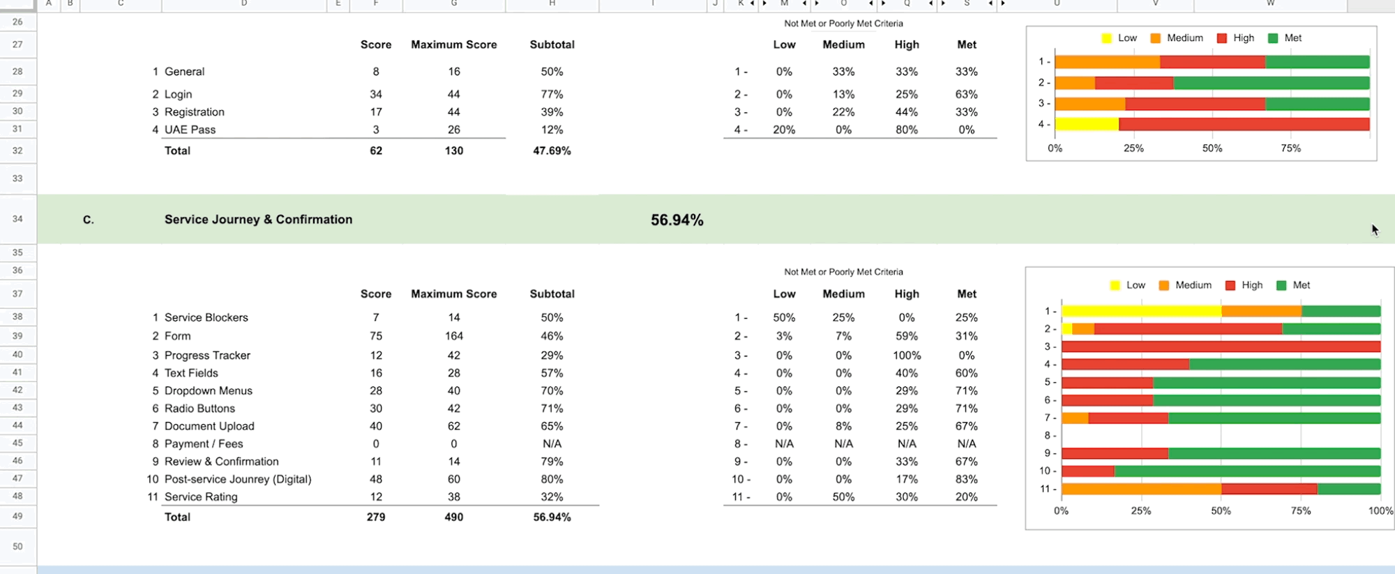
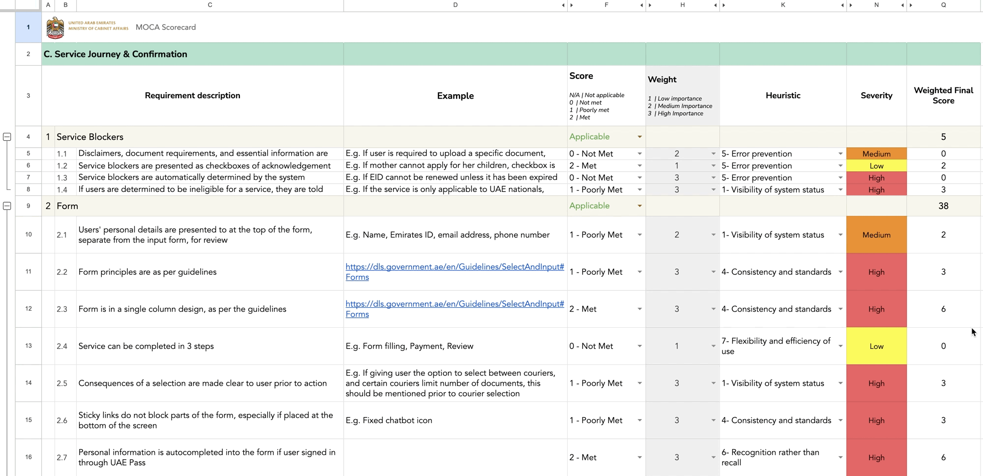
Scorecard breakdown
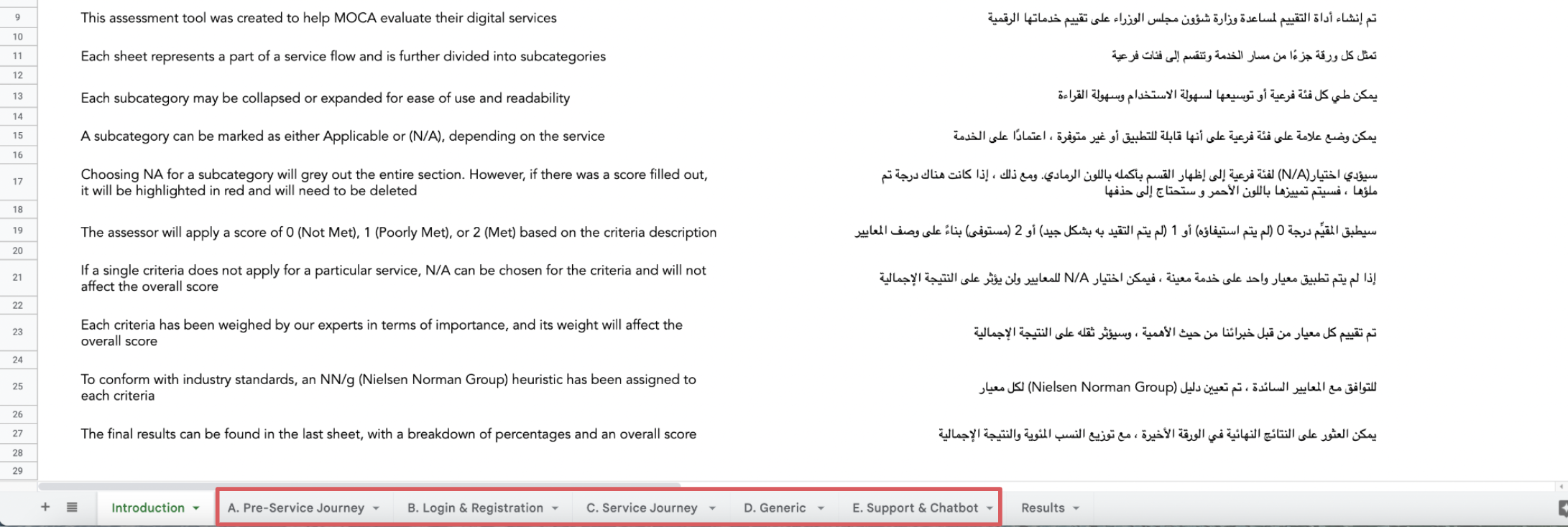
We labelled each sheet to represent a part of a service flow and further divided these flows into subcategories.
Pre-Service Journey
Login & Registration
Service Journey
Generic
Support & Chatbot
There was also an introductory sheet at the beginning, as well as a results sheet at the end.
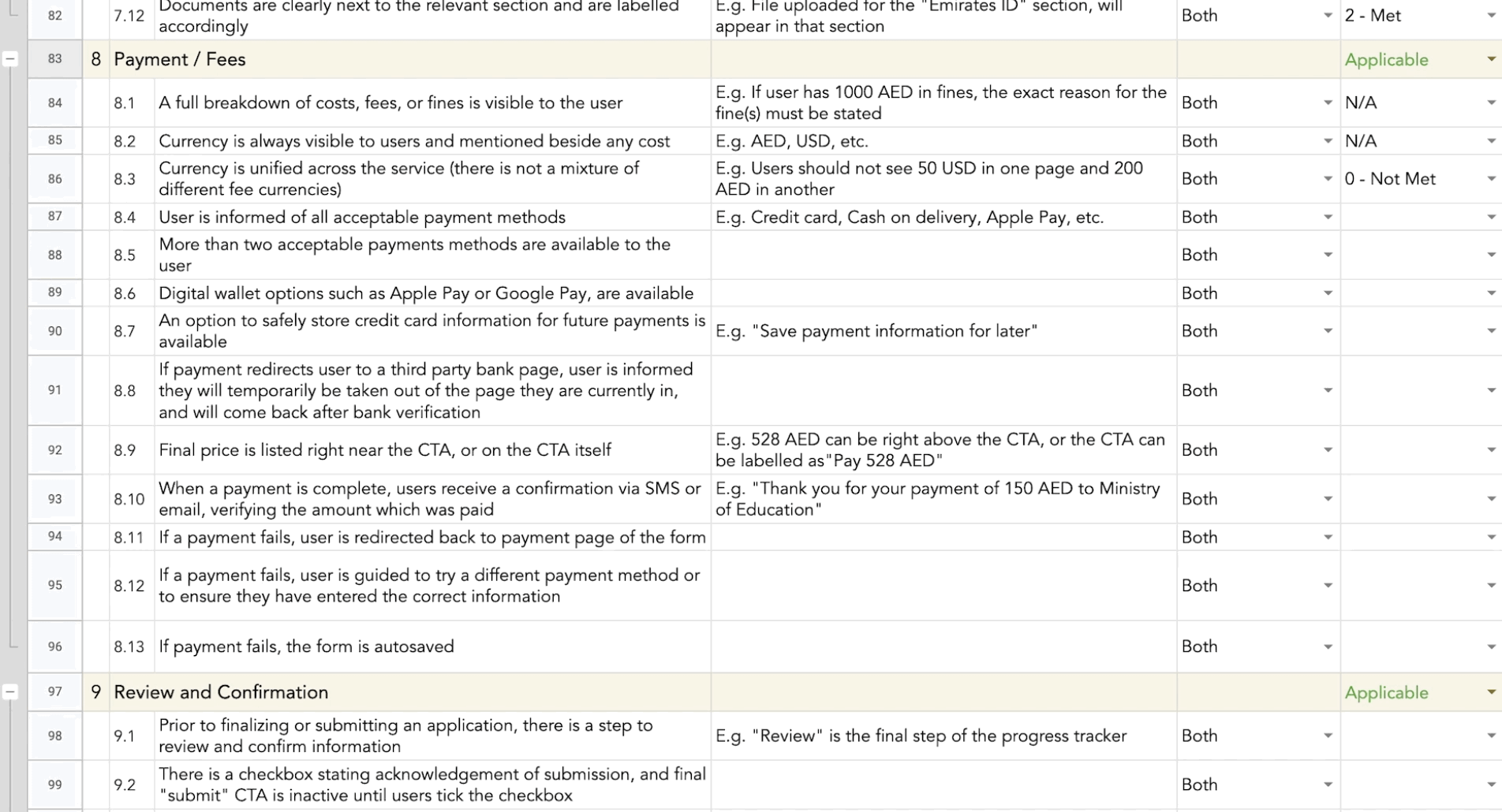
Criteria creation
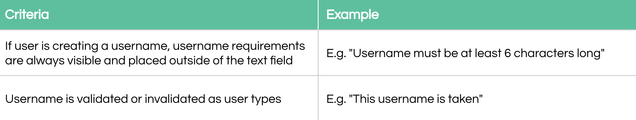
Each criteria is written as a factual statement, and to help with confusing criteria statements, we included examples to accompany most criteria requirements.
Scoring
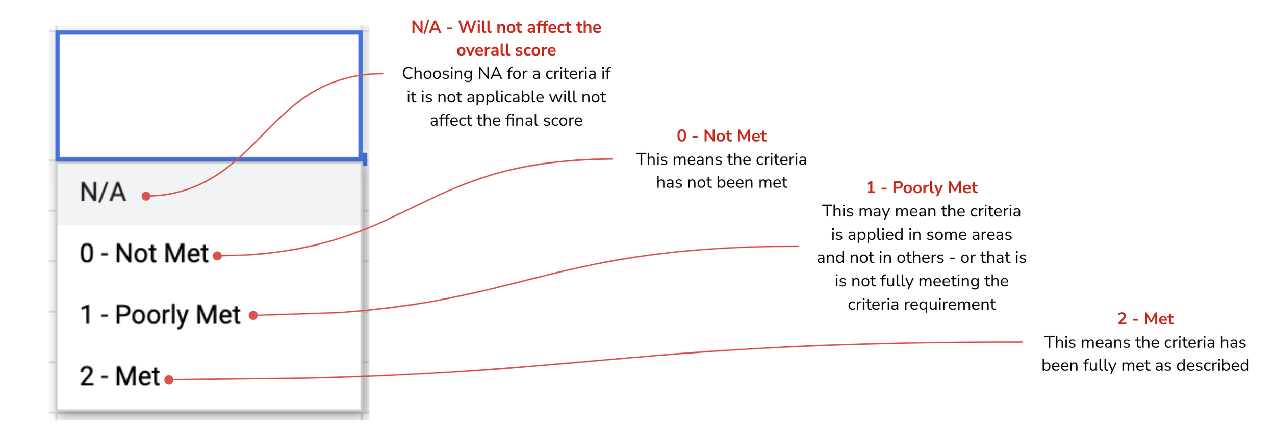
Subcategories: Applicable & N/A
An entire subcategory can be marked as either Applicable or N/A, depending on the service
For example, if a service does not require any form of payment by the user, then the “Payment” subcategory would be considered NA.
Choosing N/A for a subcategory will grey out the entire section. However, if there was a score filled out before NA was selected, it will be highlighted in red and will need to be deleted
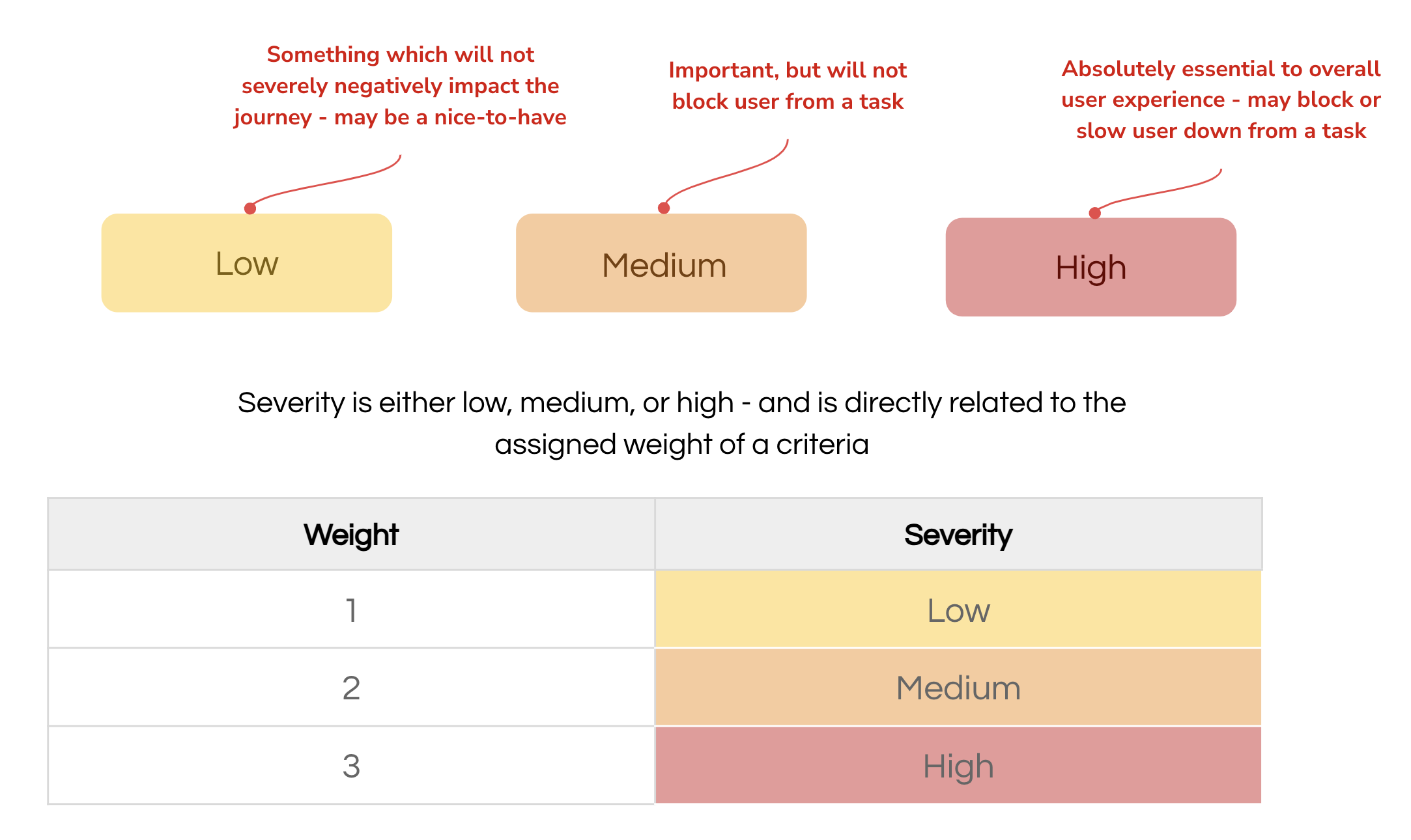
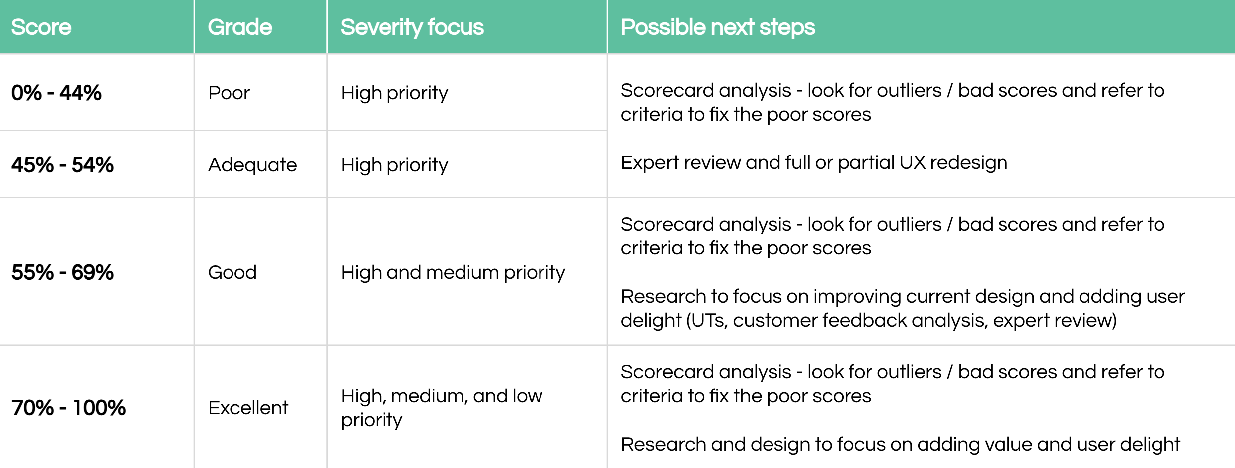
Severity levels
Interpreting results
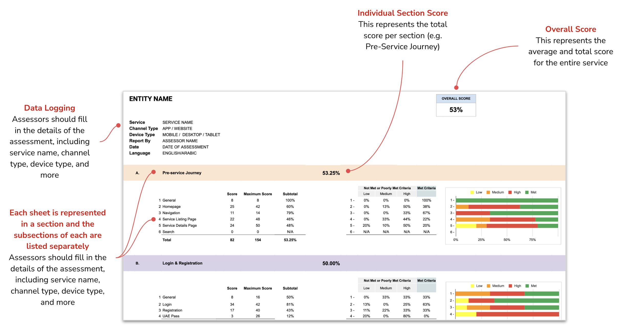
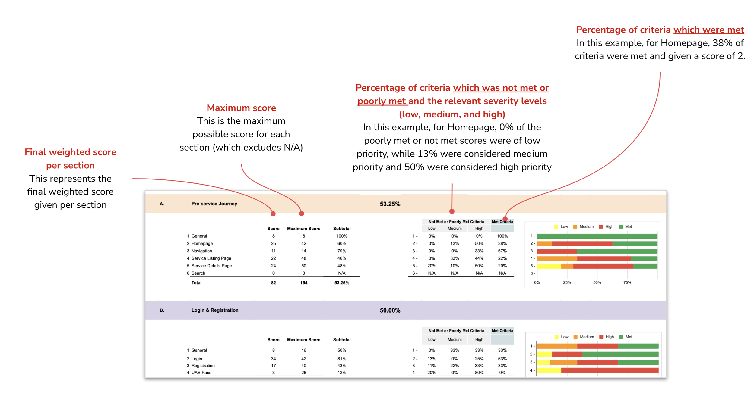
Actioning on results
Using the System Usability Scale (SUS) as our guide, we wanted to provide them with an actionable, and tangible output.
Want to take a look at the final scorecard?
Final Thoughts
I am so incredibly proud of this work - there was a lot of blood, sweat & tears which went into this Excel scorecard, but I couldn’t be more proud of the outcome.
If given the opportunity, I would love to develop industry-specific scorecards (e.g. ecommerce, fintech, etc.) and truly tailor a fully quantifiable method of assessing user experiences!